Part 2: Cleanup screens
Before we start building our own features, let’s adapt the default Expo Router template. The starter project includes its own theming and styling logic, which we’ll replace with the more powerful Unistyles approach.
App folder
Let’s start with the root layout file for the entire application.
Directoryapp/
Directory(tabs)/
- …
- _layout.tsx
- +not_found.tsx
This file sets up the root Stack navigator and uses React Navigation’s ThemeProvider along with a useColorScheme hook.
We no longer need these, as Unistyles will now manage the app’s theme state globally.
Let’s remove the old theming logic:
import React from 'react';import { DarkTheme, DefaultTheme, ThemeProvider } from '@react-navigation/native';import { useFonts } from 'expo-font';import { Stack } from 'expo-router';import { StatusBar } from 'expo-status-bar';import 'react-native-reanimated';
import { useColorScheme } from '@/hooks/useColorScheme';
export default function RootLayout() {  const colorScheme = useColorScheme();  const [loaded] = useFonts({    SpaceMono: require('../assets/fonts/SpaceMono-Regular.ttf'),  });
  if (!loaded) {    // Async font loading only occurs in development.    return null;  }
  return (    <React.Fragment>    <ThemeProvider value={colorScheme === 'dark' ? DarkTheme : DefaultTheme}>      <Stack>        <Stack.Screen name="(tabs)" options={{ headerShown: false }} />        <Stack.Screen name="+not-found" />      </Stack>      <StatusBar style="auto" />    </ThemeProvider>    </React.Fragment>  );}
Next, for the +not_found.tsx file, we only need to swap the StyleSheet import to use Unistyles:
import { StyleSheet } from 'react-native-unistyles';import { StyleSheet } from 'react-native';(tabs) folder
This folder contains the layout and screens for your TabsNavigator.
For the index.tsx and explore.tsx files, the process is the same: we simply need to replace the standard StyleSheet import with the one from Unistyles.
import { Platform, StyleSheet } from 'react-native';import { StyleSheet } from 'react-native-unistyles';For the JSX, we won’t need all these boilerplate components, so we can keep it as simple as possible:
import { StyleSheet } from 'react-native-unistyles';import { ThemedText } from '@/components/ThemedText';import { ThemedView } from '@/components/ThemedView';
export default function HomeScreen() {  return (      <ThemedView style={styles.container}>        <ThemedText type="title">          Home Screen        </ThemedText>      </ThemedView>  );}
const styles = StyleSheet.create(theme => ({  container: {    flex: 1,    alignItems: 'center',    justifyContent: 'center',  },}));
Repeat the same steps for the (tabs)/explore.tsx file.
import { StyleSheet } from 'react-native-unistyles';import { ThemedText } from '@/components/ThemedText';import { ThemedView } from '@/components/ThemedView';
export default function TabTwoScreen() {  return (      <ThemedView style={styles.container}>        <ThemedText type="title">          Explore Screen        </ThemedText>      </ThemedView>  );}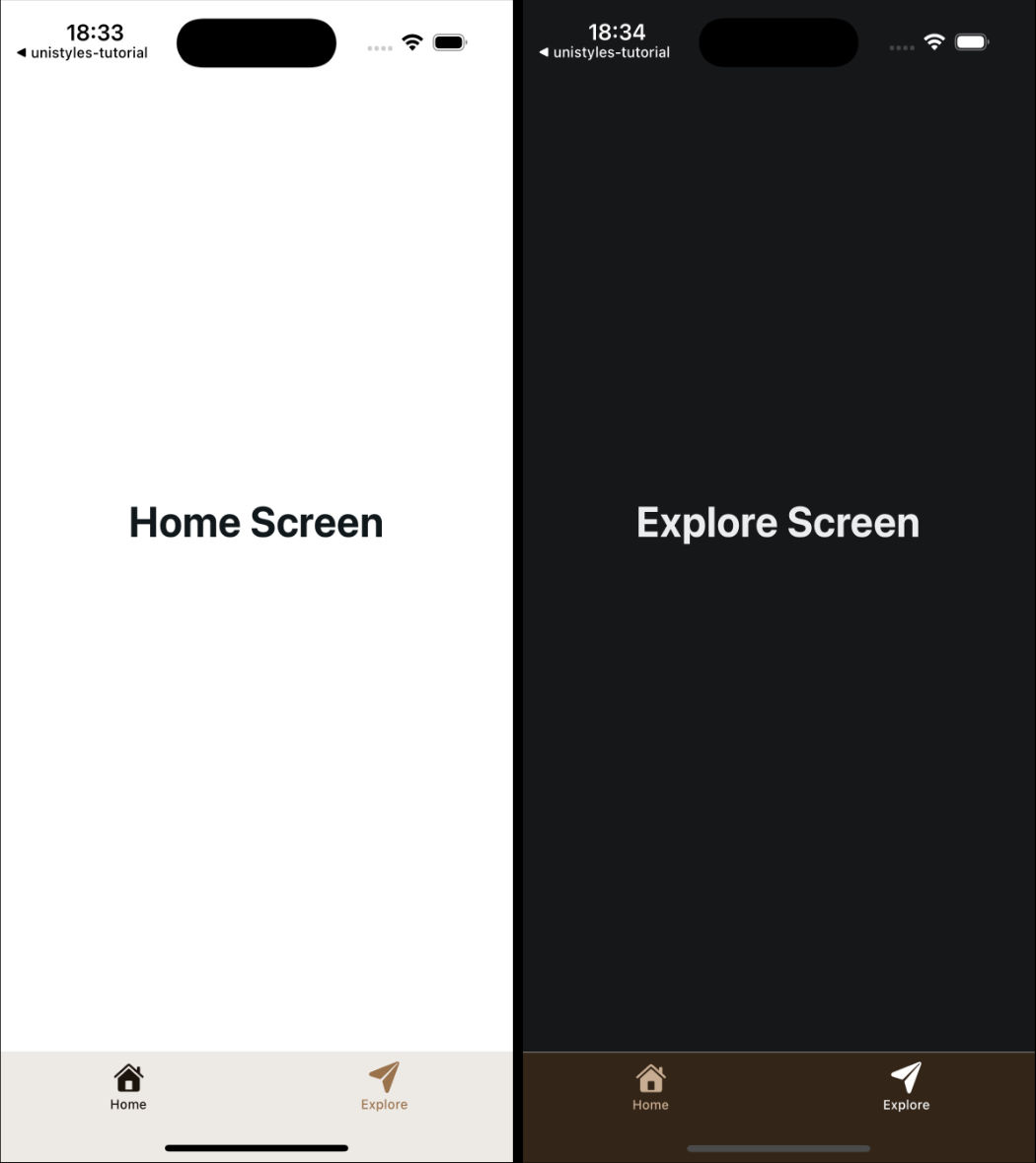
const styles = StyleSheet.create(theme => ({ container: { flex: 1, alignItems: 'center', justifyContent: 'center', },}));The most interesting file here is _layout.tsx, which configures the Tabs navigator. The default code uses the useColorScheme hook to dynamically set the tabBarActiveTintColor.
Since @react-navigation components aren’t aware of the Unistyles C++ core, they can’t be updated automatically. We need a way to get the current theme data into our component and trigger a re-render when the theme changes.
This is the perfect use case for the useUnistyles hook. It subscribes the component to theme changes, giving you access to the theme object and ensuring the component re-renders when the theme is updated.
Let’s refactor tab layout to use our new theme:
import { Tabs } from 'expo-router';import React from 'react';import { Platform } from 'react-native';
 import { HapticTab } from '@/components/HapticTab';import { IconSymbol } from '@/components/ui/IconSymbol'; import TabBarBackground from '@/components/ui/TabBarBackground'; import { Colors } from '@/constants/Colors'; import { useColorScheme } from '@/hooks/useColorScheme'; import { useUnistyles } from 'react-native-unistyles';
export default function TabLayout() {  const colorScheme = useColorScheme();  const { theme } = useUnistyles();
  return (    <Tabs      screenOptions={{        tabBarActiveTintColor: Colors[colorScheme ?? 'light'].tint,        tabBarInactiveTintColor: theme.colors.tint,        tabBarActiveTintColor: theme.colors.activeTint,        sceneStyle: {          backgroundColor: theme.colors.background        },        tabBarStyle: {          backgroundColor: theme.colors.foreground        },        headerShown: false,        tabBarButton: HapticTab,        tabBarBackground: TabBarBackground,        tabBarStyle: Platform.select({          ios: {            // Use a transparent background on iOS to show the blur effect            position: 'absolute',          },          default: {},        }),      }}>      <Tabs.Screen        name="index"        options={{          title: 'Home',          tabBarIcon: ({ color }) => <IconSymbol size={28} name="house.fill" color={color} />,        }}      />      <Tabs.Screen        name="explore"        options={{          title: 'Explore',          tabBarIcon: ({ color }) => <IconSymbol size={28} name="paperplane.fill" color={color} />,        }}      />    </Tabs>  );}
With these changes, you can now switch your device’s color scheme, and you’ll see the tab bar’s tint color update instantly, powered by Unistyles!